


Purchase completed? Order already placed? For the customer, this is just the beginning of the adventure with your e-Commerce. And for you, it’s not the end either. You still need to fulfill that order. Along the way, there are a few other steps you should take. One of them is the order confirmation. Unfortunately, many companies underestimate this topic. They throw in some generic content, written by AI, or worse – use a default template provided by their e-Commerce platform. And then they’re surprised when the customer doesn’t come back. So how can you design an order confirmation properly? And how can you use it to strengthen the post-purchase experience?
Why Does an Order Confirmation Email Matter?
Who would’ve thought that a simple email sent to a customer after completing a purchase could be important? It’s just another message in the customer’s inbox, likely never to be opened, right? Wrong! Order confirmation emails have the highest open rates. According to ExpertSender, as many as 65–70% of these emails are opened. That’s quite a lot. 😉
Unfortunately, many companies still don’t see the point in investing time and resources into something so “trivial.” So they send just any message “because they have to,” without really thinking about the role it plays in the customer journey. Then they’re surprised when customers don’t return, their customer service team is overwhelmed, and returns are flooding in from every direction.
The order confirmation email IS IMPORTANT. It should not be underestimated, because it serves a truly vital role.
- It builds trust
Thanks to this simple email, the customer knows the transaction went through, and the store received all the necessary information (and payment). Now all they have to do is wait for the courier to arrive with the package. - It impacts your credibility
The order confirmation is the first post-sale touchpoint. It affects how the customer will perceive your brand, either as a reliable company that builds relationships and is worth staying with long-term, or as a money-hungry corporation that only cares about sales, not the people. - It supports your customer service team
By receiving an order confirmation and information about the next steps, the customer is no longer left wondering or needing to call customer service and ask, “What now?” - It reduces returns
In the order confirmation email, the customer can double-check what they’ve ordered and make sure they didn’t make a mistake (like choosing the wrong size shirt). If something is wrong, they can cancel or change the order before the incorrect product is delivered to their doorstep. - It increases retention
A well-designed order confirmation signals that the store is reliable and worth returning to. And if the customer keeps that email in their inbox, it makes it easier for them to find the store again and make another purchase in the future.
As you can see, an order confirmation email isn’t just a formality to check off because “that’s how it’s done.” It’s a tool that should be used to build a strong brand and lasting customer loyalty.
What Should a Good Order Confirmation Contain?
Creating a purchase confirmation email might seem simple. Yet, many e-Commerce businesses still make mistakes in this area and send incomplete emails that add little to the customer journey, and often complicate it even more. That’s why we’ve prepared a list of key elements that should be included in such an email. We want your order confirmations to be effective and beneficial (as mentioned above). So let’s get started!
Order details
The order confirmation email is where the customer can verify that they haven’t made any mistakes during the ordering process. The wrong product size, a missing discount they were counting on, or incorrect delivery information – these are all issues that can have serious consequences. The first two cases typically result in a return; incorrect shipping details mean the courier may not be able to deliver the package, or worse, it could be sent to the wrong address. All these scenarios cost you money, often a significant amount. Even if returns aren’t free in your store, you’ll still have to pay for handling them and restocking the product.
That’s why your confirmation email should always include:
- a list of ordered products (with images)
- prices and applied discounts
- shipping and billing information
Only then can the customer be 100% sure that they placed their order correctly. And you can sleep peacefully, without worrying about a flood of returns and unexpected costs.
Order Fulfillment Status
You’ll send emails about order status updates in the next steps of the process. However, that doesn’t mean this critical information should be missing from the purchase confirmation email. Let your customer know that their order has reached you and inform them about the next steps in the fulfillment process. What kind of steps? That depends on your industry and business model. If you’re making custom furniture, inform the customer how long they can expect to wait. For example: “Thank you for your order. We’re starting production of your table. Our products are handmade, so that it may take 2–3 weeks.” In other industries, an estimated delivery time might be enough. For example: “Thanks for your purchase. Your dream product will arrive within 2–3 days.”
This information is crucial for two main reasons:
- Customers like to know when to expect the courier at their door, so they can ensure they’re home to receive the package.
- Customers may have missed the delivery time on the product page. And if they’re impatient or on a tight schedule, they’ll get frustrated if the package takes longer than they expected. That naturally leads to more customer service inquiries and… returns.
Payment Information and Delivery Method
There are now several methods for paying for online purchases. Most often, we pay immediately using a quick bank transfer, BLIK, or a card. But not always. Sometimes payment is deferred, and even then, several options are available, such as Klarna, PayPo, or Twisto. There’s also manual deferred payment, such as the one Zalando offers, where you need to click a link in the app or email to complete the payment. And let’s not forget the good old traditional bank transfer.
Regardless of which payment methods you offer in your store, your order confirmation email should clearly state which one the customer chose. For immediate payments, a simple “status: paid” might be enough, without specifying the method, though including it doesn’t hurt either. In the case of deferred payment, however, you’ll need to provide more details about what happens next. If the customer used Klarna, briefly explain the terms of that service. If they choose a deferred payment option, such as Zalando’s, inform them of the time frame for completing the payment and include a direct checkout link for a seamless experience. If you still accept traditional transfers, please provide all necessary bank details in the email so the customer can complete the transaction. Remember: the easier you make it for the customer to pay, the less you’ll have to chase them to settle the bill.
Now for the delivery method. It’s also worth including this in the order confirmation email. Why? The customer can then verify where to expect the package – at home, in a parcel locker, or at a pickup point. Also, let them know which courier company will be handling the delivery. This is very important because, in the event of any delivery issues, the customer will be able to contact the courier directly, track the parcel, or reschedule the delivery date.
Call to Action
No, this isn’t about upselling – it’s about giving your customer the ability to take action related to their order. What kind of actions? For example: tracking the shipment or editing the order. After all, you don’t want your customer service team to be bombarded with questions about the status of an order or requests to swap out products. Allow customers to handle it themselves by including relevant links in the order confirmation email. It’s also a good idea to add a clear and accessible way for customers to contact your store, so that if any problems arise, they can easily reach out.
Links to Terms, Return Policy, FAQ
This might seem unnecessary, after all, those documents are available on your website, and customers can simply look them up. But the modern customer doesn’t want to look. If they placed an order in your store and later have questions, they won’t want to browse your site in search of answers. They’re more likely to initiate a chat or make a phone call to resolve their issue more quickly. On the surface, that’s fine, after all, you do provide those channels for customer contact. But here’s the catch… Your support team won’t be able to handle more serious requests if they’re swamped with minor issues. That’s why it’s smart to include links in the confirmation email to the most important resources: Terms & Conditions, Return and Complaint Policy, and Frequently Asked Questions (FAQ). This way, your customers can quickly find the information they need, and your support team can focus on what truly matters.
Consistent Branding and Clear Structure
An order confirmation email shouldn’t be generic. It must be fully aligned with your brand – in both tone of voice and visual design. This email is one of the many touchpoints between the customer and your e-Commerce business. It should not stand out as something inconsistent with your other communication channels.
When designing your confirmation message, remember: this is not just another trivial email. It’s one that most online shoppers actually open and rely on as a valuable source of information. Ensure it’s clear, well-structured, and complete.
A well-designed order confirmation email makes life easier not just for your customers, but also for you (or more precisely, your post-purchase support team). So treat it seriously and design it to the highest standards.
Best Practices in Order Confirmation Emails – 6 Examples from the Polish Market
Now that we know all the elements that should be included in an order confirmation message, it’s time to look at how this works in practice. We’ve gathered six examples of such emails from brands that, in our opinion, do it well. Let’s take a look at how Empik, My Rituals, Media Expert, Zalando, Notino, and Ikea handle order confirmation emails.
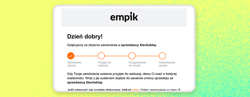
Empik – Functionality and Transparency
Empik is no longer just a bookstore and multimedia shop – it’s now one of the largest marketplace platforms in Poland. That means its order confirmation emails must do more than just inform about a purchase – they also need to clarify who is responsible for fulfilling the order. And this is precisely what Empik does well.
At the top of the email, the customer is informed that the purchase was made from an external seller. This is extremely important, as many customers may not even realize they’re using a marketplace rather than buying directly from Empik. This message eliminates confusion and communicates who’s fulfilling the order and what will happen next. This transparency builds trust.
What’s more, the top section of the email includes a visual progress bar showing the order stages – from “Order Received” through “Shipped” to “Delivered”. Although only the first step is marked as active at this stage, this simple graphic lets the customer know that the process is being tracked and that they’ll receive updates as their order progresses. A slight touch, but it works brilliantly. It creates a sense of predictability and control.
And it gets better. The customer also receives a specific delivery date, presented as a time range (“21.03.2025 – 24.03.2025”), allowing them to plan accordingly to receive the package.
The email also includes all key information:
- Order number
- Product details (name, price, category)
- Shipping cost and total order value
- Shipping address, payment method, and delivery method (in this case: parcel locker from InPost)
At the bottom of the message, you’ll find helpful links to important sections, including Return Policy, Contact, Terms and Conditions, and Order Details. All of this is presented in a clean, structured layout, without unnecessary clutter.
Also worth noting is how Empik handles payment communication. If the customer hasn’t yet paid, they receive a clear message with a payment button and a reminder about the time limit (“5 days”). It’s an effective way to reduce abandoned orders and prompt customers to complete their purchase.
This email is clear, complete, and extremely practical, which is absolutely essential for a marketplace dealing with multiple sellers.
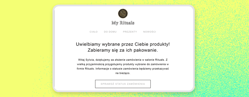
My Rituals – A Sense of Care From the First Click
Some brands pay attention to every detail of the customer experience – from the packaging to… the order confirmation email. That’s precisely the case with My Rituals. From the very content of the message, it’s clear that this is a company that understands premium-level customer care.
What stands out right away? The warm, calm tone of communication. Instead of simply confirming a purchase, My Rituals speaks to the customer as if they are someone they genuinely know: “We’re happy to have you with us.” It’s short, but heartfelt. You can immediately sense a conscious, consistent brand voice – a big plus.
The email contains all the key elements an order confirmation should include:
- Full order details (products, price, quantity, delivery method)
- Shipping address and payment method
- Status update: “Your order has been confirmed and is being processed”
But it goes further. My Rituals clearly communicates what happens next. The customer sees that their order follows a specific process – from confirmation to delivery. That means no guesswork, and no need to contact customer support to ask where their package is.
Front and center in the email is also a prominent “Track Your Order” button. This essential yet straightforward feature enables customers to check on their order with a single click, without needing to log in to their account. It saves time and reduces the volume of inquiries to the support team.
A brilliant addition is the FAQ section placed directly in the email body. Instead of linking out to a separate page, My Rituals addresses two top customer concerns immediately: “Can I change my order?” and “How long does delivery take?” It’s a slight touch that makes a big difference, providing peace of mind before questions even arise.
At the bottom, there’s a range of easy contact options: Messenger, WhatsApp, and a phone hotline. All just one click away, with no need to browse the site.
And the cherry on top? The visual design of the email is minimalist, elegant, and fully aligned with the My Rituals brand identity. This isn’t just an email, it’s another touchpoint in the customer journey that reinforces the feeling: You made the right choice.
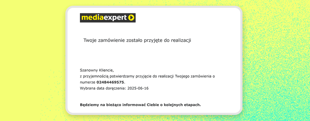
Media Expert – Simplicity, Clarity, and Information Front and Center
Media Expert doesn’t try to evoke emotions, lean into storytelling, or polish its branding excessively. And rightly so, because in their case, it’s all about straightforward communication. The customer places an order and wants to know: what’s next? Media Expert responds clearly: “Your order has been accepted for processing.”
Right at the start of the email, the customer receives a clear status update. No ambiguity. Everything went smoothly, and the order has entered the system. The email also provides the exact delivery date, chosen during checkout, allowing the customer to plan ahead. It’s crucial for larger or more valuable items, such as a washing machine or a TV.
A strong point is the clean and simple layout of the order details:
- Product list (with names and item codes)
- Prices
- Final total
- Payment method (e.g., BLIK)
- Delivery method and exact pickup address
An interesting and convenient feature: Each product name is a clickable link that redirects to its product page. If the customer has any doubt about whether they ordered the right model, they can quickly check. This small touch helps prevent unnecessary returns and increases customer confidence in their purchase.
Another highlight is the block of useful links at the bottom of the message, including “Track order”, “Cancel order”, and “Contact”. These act as the main CTAs (calls-to-action) in this email. They are prominently displayed, easy to click, and clearly labeled – no guesswork needed. The customer knows exactly what they can do and where to click.
Media Expert also handles return information very well. The email includes not only the return policy but also the estimated cost of returning the specific product (in this case: 27.99 PLN for a bathroom scale). Even more impressively, the terms and conditions are attached as a PDF – a rare move, but one that shows the brand plays fair and doesn’t bury details deep within the website.
Visually, the email may not be a design masterpiece, but it gets the job done. It’s a well-thought-out operational email that:
- Reduces customer service inquiries
- Minimizes errors and misunderstandings
- Gives customers a sense of control
As you can see, Media Expert focuses on what matters and it pays off.
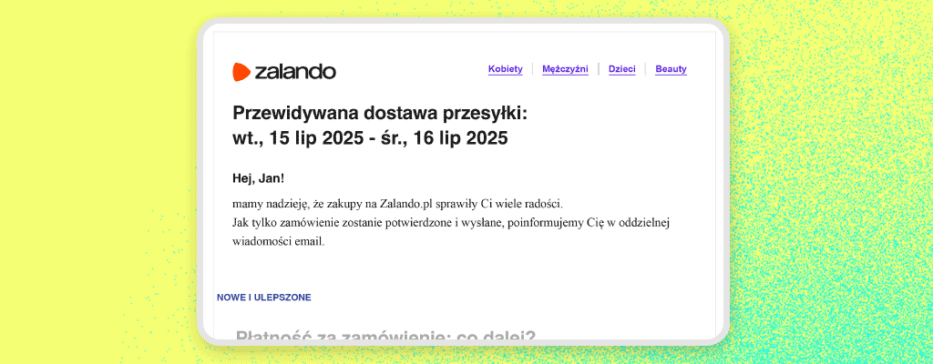
Zalando – Effective Communication Without Excess
Zalando is one of those retailers that proves simplicity and predictability matter more to customers than flashy design. Their order confirmation email isn’t overly elaborate or saturated with marketing. And that’s precisely why it works so well.
Right from the start, the customer sees a clear message: “We’ve received your order.” Short, straightforward, no fuss. The customer knows everything went through correctly and can calmly wait for the next steps. Immediately below is the estimated delivery date (e.g., “Tue, July 15 – Wed, July 16”), which helps customers plan and reduces unnecessary inquiries to customer support.
Zalando offers multiple payment options, including upfront card payments, BLIK, PayPal, and a quick bank transfer. In this example, the customer chose a deferred payment option, and that is clearly communicated in the email. They’re informed that they don’t have to pay now, and that they’ll have 30 days after receiving the order to do so. This provides a sense of financial flexibility, and Zalando leverages it well with simple, transparent messaging, no hidden conditions marked with asterisks.
The rest of the email maintains that same standard:
- The delivery method and pickup location (e.g., parcel locker) are clearly shown
- The order summary includes a product image, name, size, and price
In the center of the email, there’s a prominent and easily clickable “Check Your Order” button, which leads directly to the customer’s account—no need to hunt for links, enter order numbers, or re-log into the site. One click, done.
At the bottom, there’s a “Help & Contact” section with links to the support page.
Notably, there are no distractions or pushy cross-sell suggestions. Those are subtly tucked under the “Create an outfit” link. The email stays laser-focused on what’s most important to the customer in that moment.
The entire message is also mobile-friendly, clean, readable, and user-friendly, which is crucial since most Zalando users browse and shop via smartphones.
Zalando clearly understands that an order confirmation email is, above all, a tool for providing information. Explicit content, smooth navigation, and transparent communication. That’s what makes customers feel secure. And that’s what keeps them coming back.
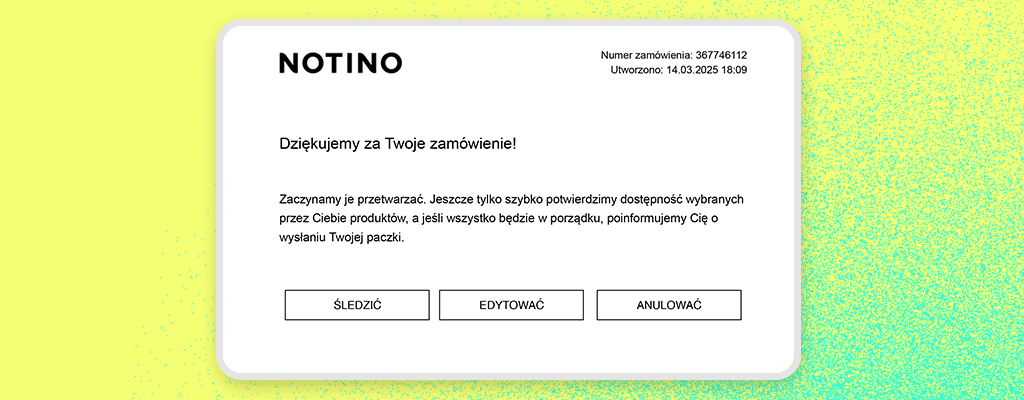
Notino – Self-Service Without Logging In
Notino demonstrates just how well an order confirmation email can be structured in a large-scale e-Commerce environment. Their message is a textbook example of functionality, clarity, and customer self-sufficiency.
The email starts in a standard way – with a thank you for the purchase and confirmation that the order has been received. But what follows is particularly impressive.
Right at the top, there are three clearly labeled buttons:
- Track Order
- Edit Order
- Cancel Order
This is a brilliant solution that gives the customer a real sense of control. No need to log into an account or contact customer service – customers can immediately take action: update information, cancel the order, or check delivery status. In an age where customers expect instant response and autonomy, Notino delivers precisely what they want.
Further down, the email includes:
- A complete order summary (product name, image, quantity, price, delivery method)
- Shipping address, payment method, and total order value
- Information about the delivery method (e.g., to an InPost parcel locker)
Instead of redirecting users to a help page, Notino includes short info sections directly within the email, such as a note about the “Try it First” service (which lets you test a sample before opening the product). This is a nice value-added feature that can reduce return rates while boosting brand trust.
The email concludes with classic yet essential elements: contact details (phone, email, and company address), as well as attached documents (terms and conditions and a privacy policy). That earns a big plus for transparency and well-organized formalities.
As for the design? It’s clean, clear, and mobile-friendly. No surprises, no glitches, no walls of text. Just a well-designed transactional email.
Notino proves that a great confirmation email isn’t just a receipt, it’s a purchase control center. Self-service, transparency, answers before questions arise – everything is right where it should be.
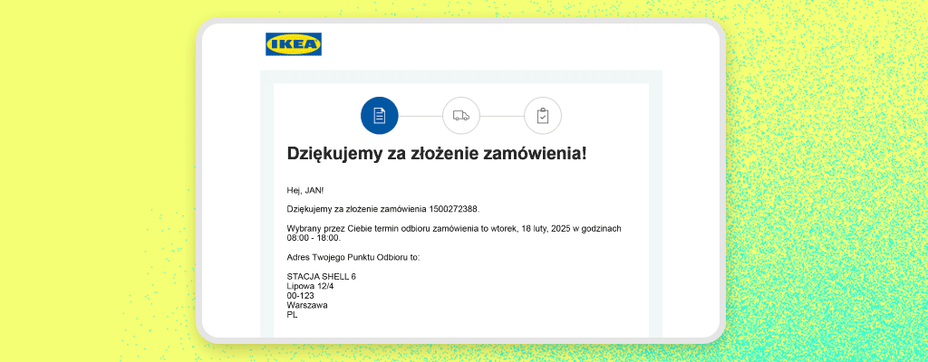
IKEA – A Simple Email That Answers Every Question
IKEA doesn’t overcomplicate things. And that’s a very good thing. Their order confirmation email is precisely what it should be: clear, specific, and helpful. It doesn’t try to impress with flashy visuals or masquerade as a newsletter. This is pure functionality – a great example of how to streamline customer communication to the max.
The message opens with a short thank-you and confirmation that the order has been received. Then, the customer immediately sees the most essential information: when and where to pick up their order. IKEA clearly states the pickup date and location where the products will be waiting. No need to search, no need to ask. This works exceptionally well for in-store pickup orders, which are pretty familiar with IKEA.
Further down, the customer sees:
- The order number and date of purchase
- The exact address of the pickup point with its opening hours
- The selected delivery and payment method (e.g., online card payment)
- A product list – with name, price, and quantity
- The total value of the order
Everything is laid out in a logical structure, moving from general to detailed. That way, the customer can quickly check that everything is correct without needing to dig through the email for key info.
One subtle but important touch is the message: “Once your payment is processed, we’ll send you another message with the invoice.” A small detail, but one that builds trust and prevents questions about formalities – because the customer knows what to expect and when.
Further down, there’s a clearly labeled button “Track and manage your order”. This allows the customer to monitor progress or report a problem if needed easily.
Although the email is visually simple, its layout is designed to be highly readable and intuitive, even on mobile devices. That’s crucial, since many people open these types of messages “on the go”, in a queue, or on their way to the pickup point.
Ultimately, IKEA includes the standard contact information, customer number, and a reminder about available support options. There’s no overload of content, but nothing essential is missing. The email also includes terms and conditions, cancellation forms, and service price lists, offering the customer a comprehensive information package.
IKEA shows that an order confirmation email doesn’t have to be flashy to be effective. Customers get everything they need, in a logical order, in a friendly and functional format. And that’s the whole point.
While each of these brands operates differently, some are marketplaces, others focused on premium experiences or simple in-store pickups, they all share the same strengths in their confirmation emails. They are:
- Clear – no clutter, no walls of text, no unnecessary decoration
- Straightforward – customers instantly know what, where, when, and how
- Useful – with links to edit, track, or cancel an order
- On-brand – even minimalist messages stay true to the company’s communication style
These aren’t emails customers have to “decode.” They’re actionable tools that reduce support tickets, build trust, and enhance the shopping experience. No matter the industry or target audience, any e-Commerce business can learn something from them.
What Comes After the Confirmation?
The order confirmation email is just the beginning of your journey in building a great post-purchase experience. There’s still work to do, such as sending status update emails (for example, when the order is packed, shipped, or delivered). Customers want to stay informed about the status of their purchase. So give them that peace of mind by sending a message every time the status of their order changes.
Just as with the confirmation email, your other transactional messages should also be of the highest quality and consistent with your brand’s communication.
But that’s not where the journey ends. You can further fuel positive post-purchase impressions by sending your customers a request for a review, discount codes, or suggested products they might like. However, remember that your emails must not be pushy. We live in times when inboxes are overflowing with spam from every direction. Too many messages from your store can simply irritate your customers. And that’s the last thing you want. So be thoughtful and intentional with your follow-up emails.
E-Commerce isn’t just about emails. Remember that you can also build positive post-purchase experiences in other ways, such as through efficient returns and complaint handling, as well as effective support. All of this matters and influences whether the customer will trust you again and return to your store when they’re ready to buy another product from your offer.
Summary
An order confirmation is more than just a technical notification. It’s a crucial communication touchpoint with the customer, one that can either strengthen trust in your brand or undermine it entirely.
A well-designed email can save you time, reduce returns, decrease the number of customer support inquiries, and encourage customers to come back happily. So don’t treat this message as a mere formality. Treat it as a valuable opportunity to communicate effectively, build strong relationships, and demonstrate that you genuinely care about your customers’ experience. Because in e-Commerce, even an ORDINARY confirmation email can have EXTRAORDINARY power.
